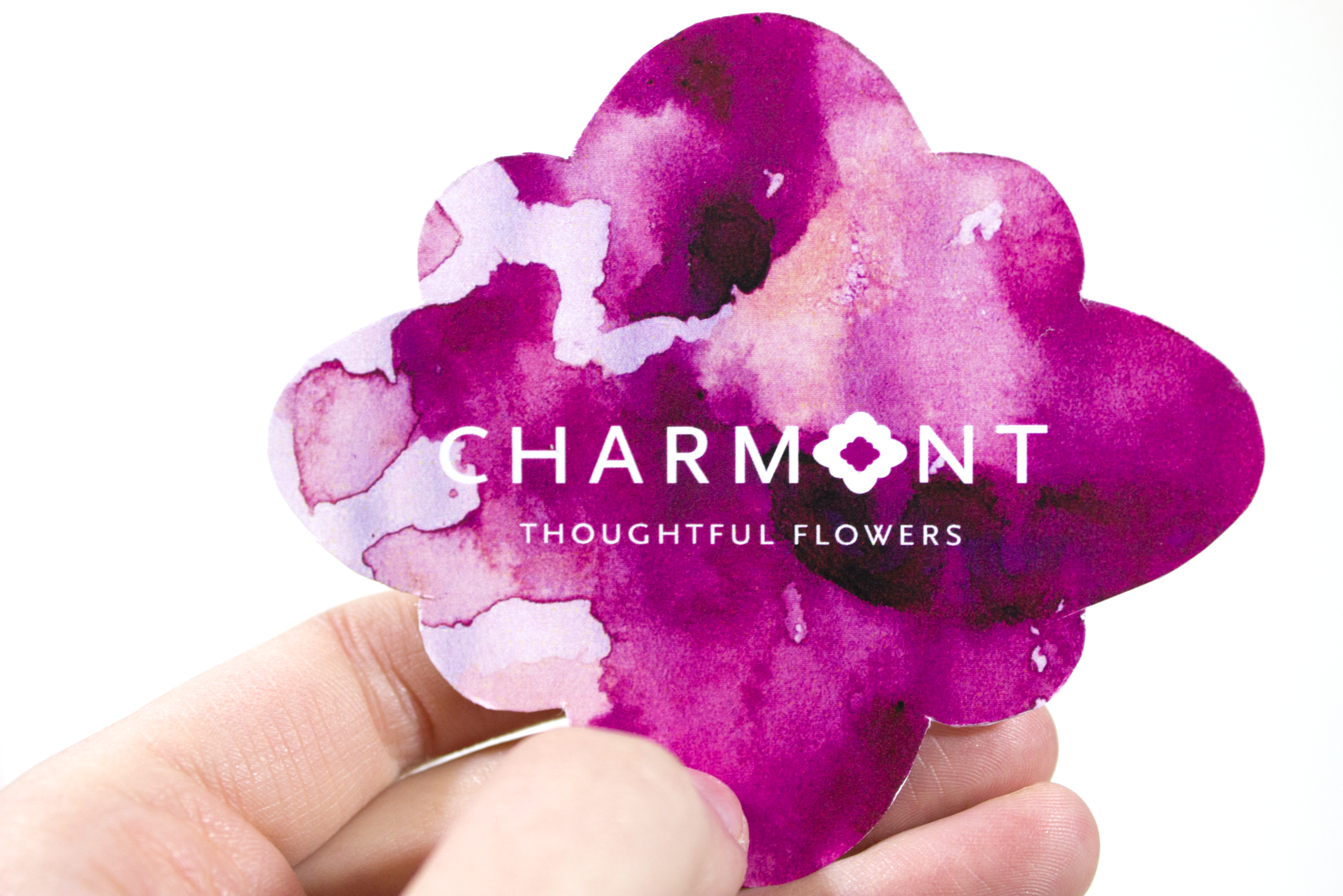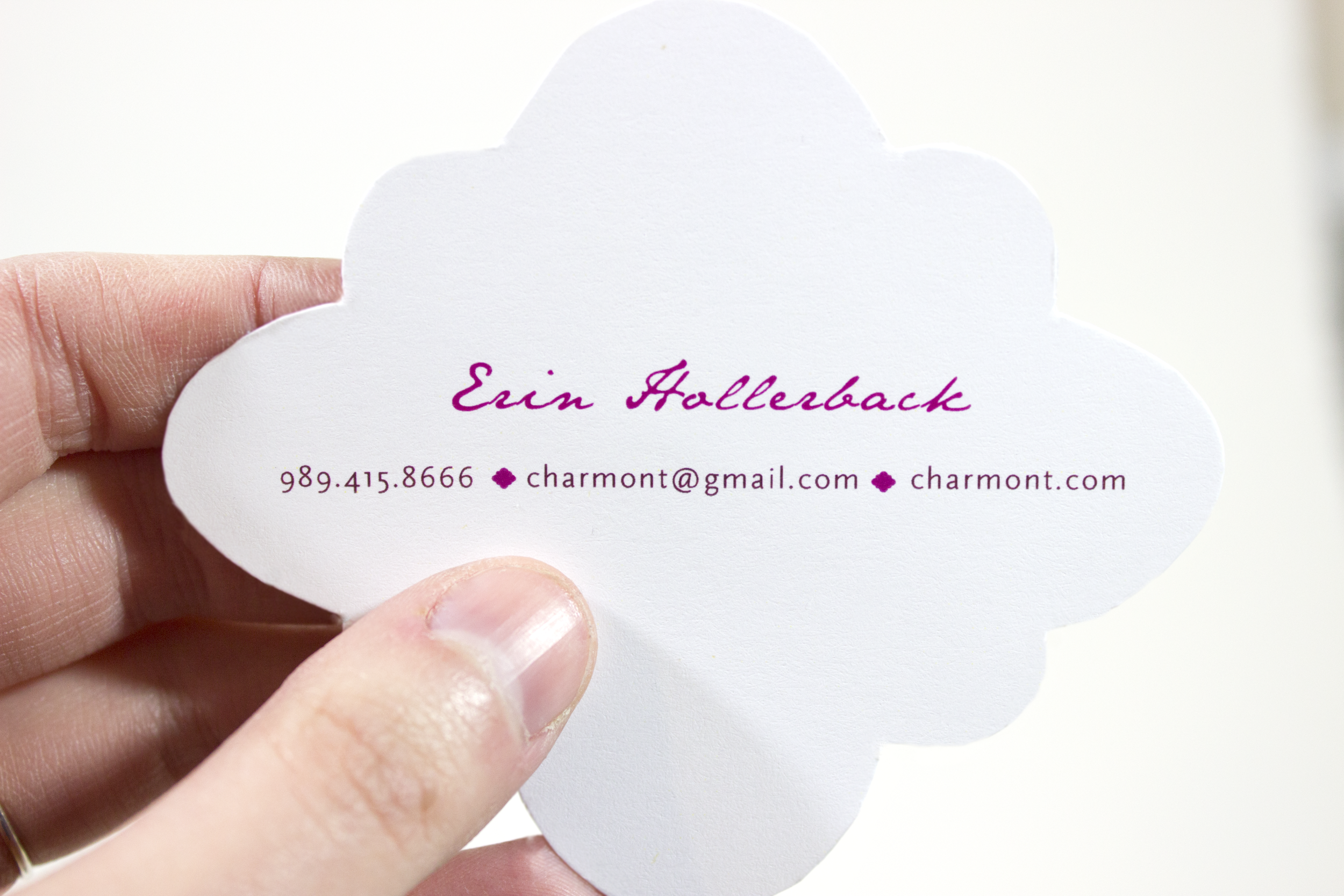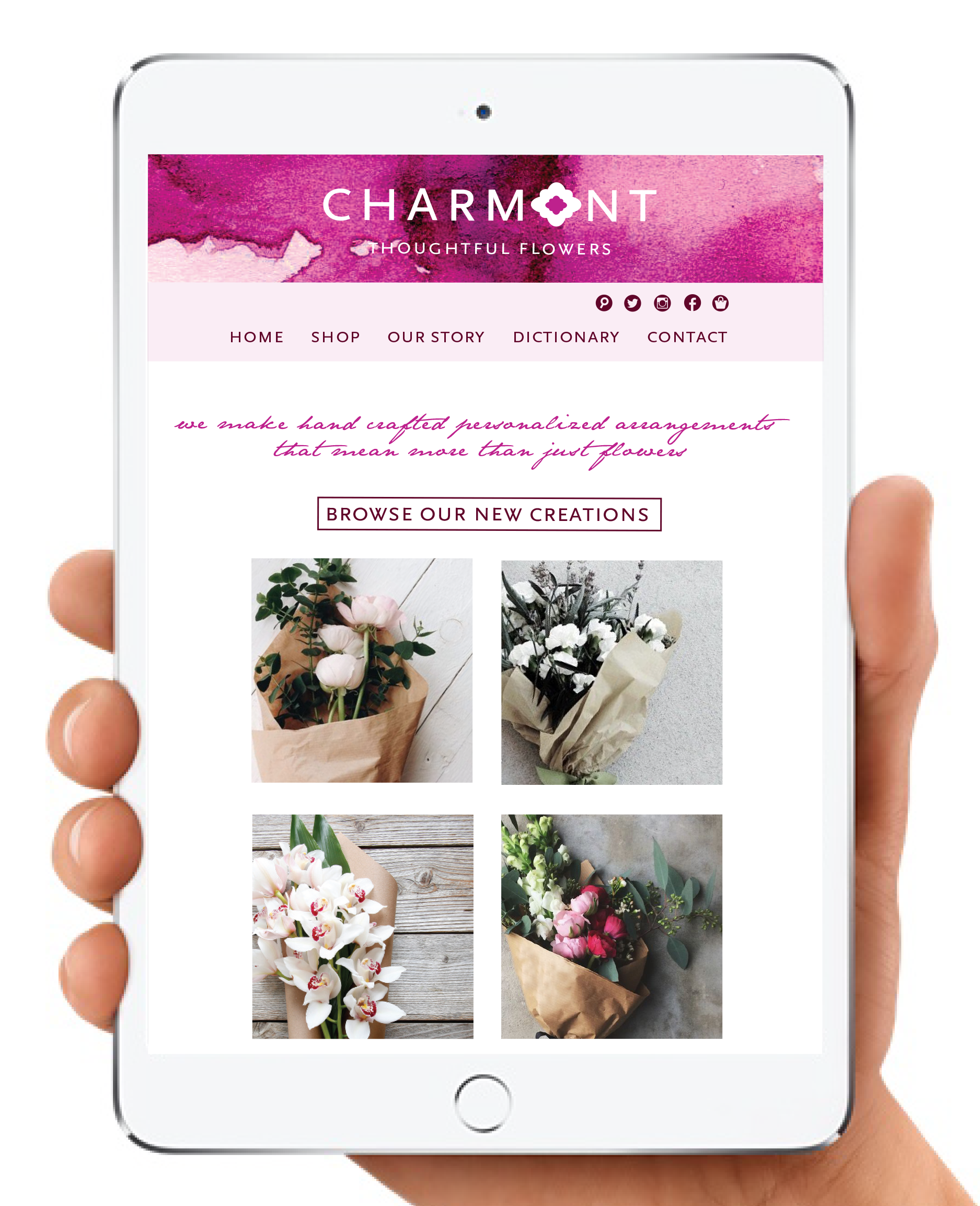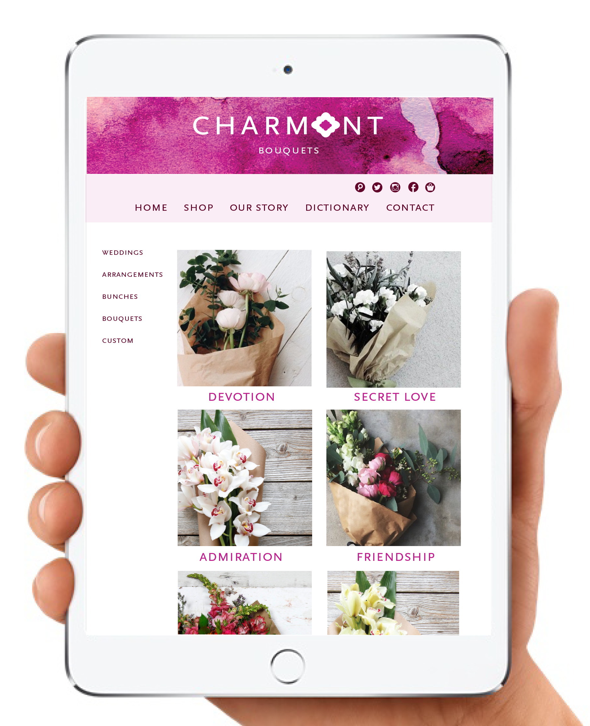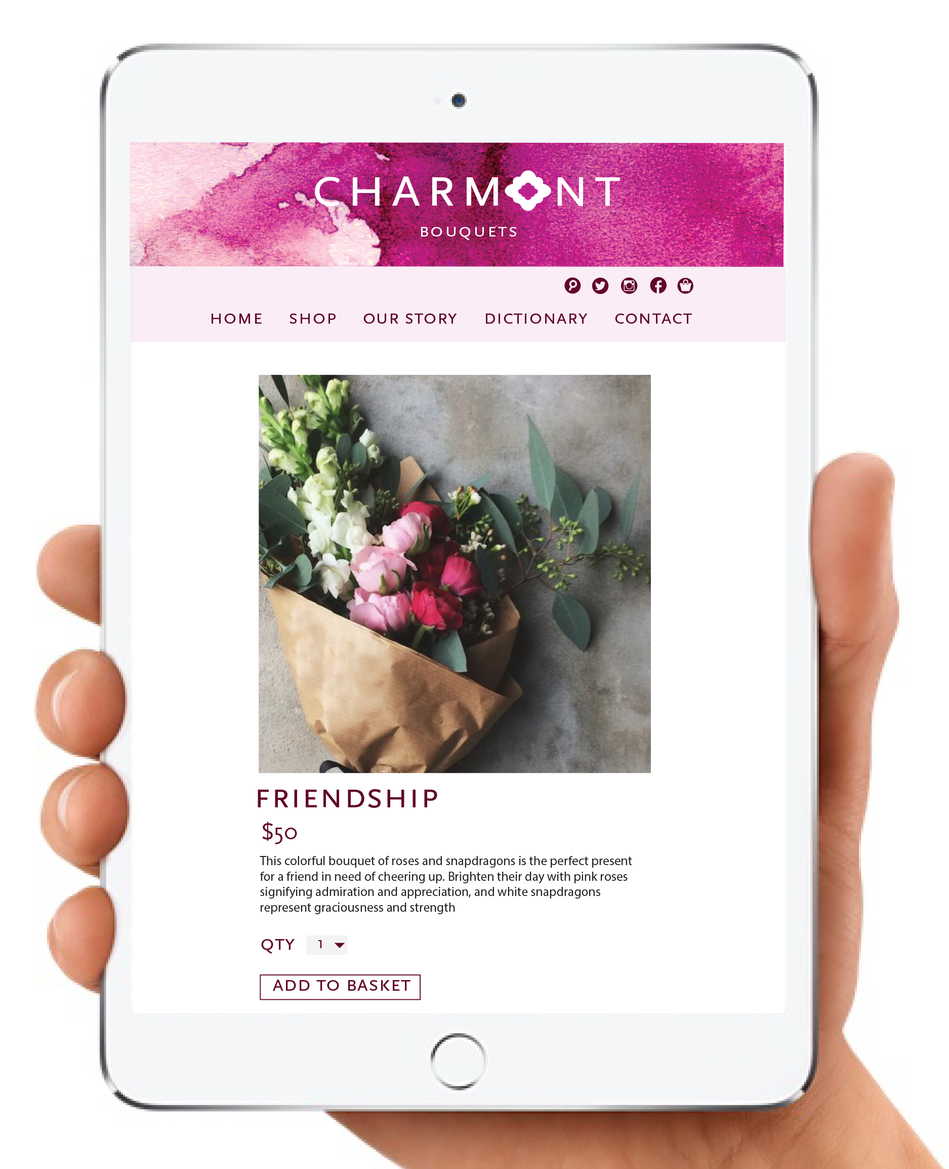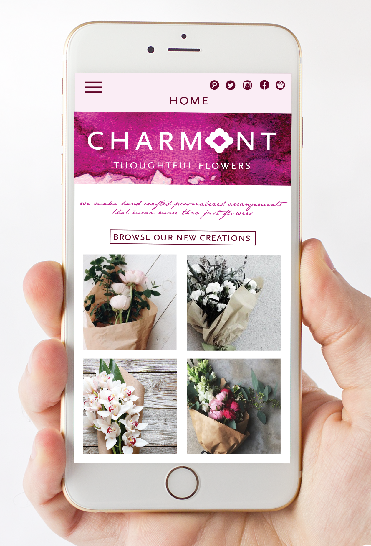
CHARMONT

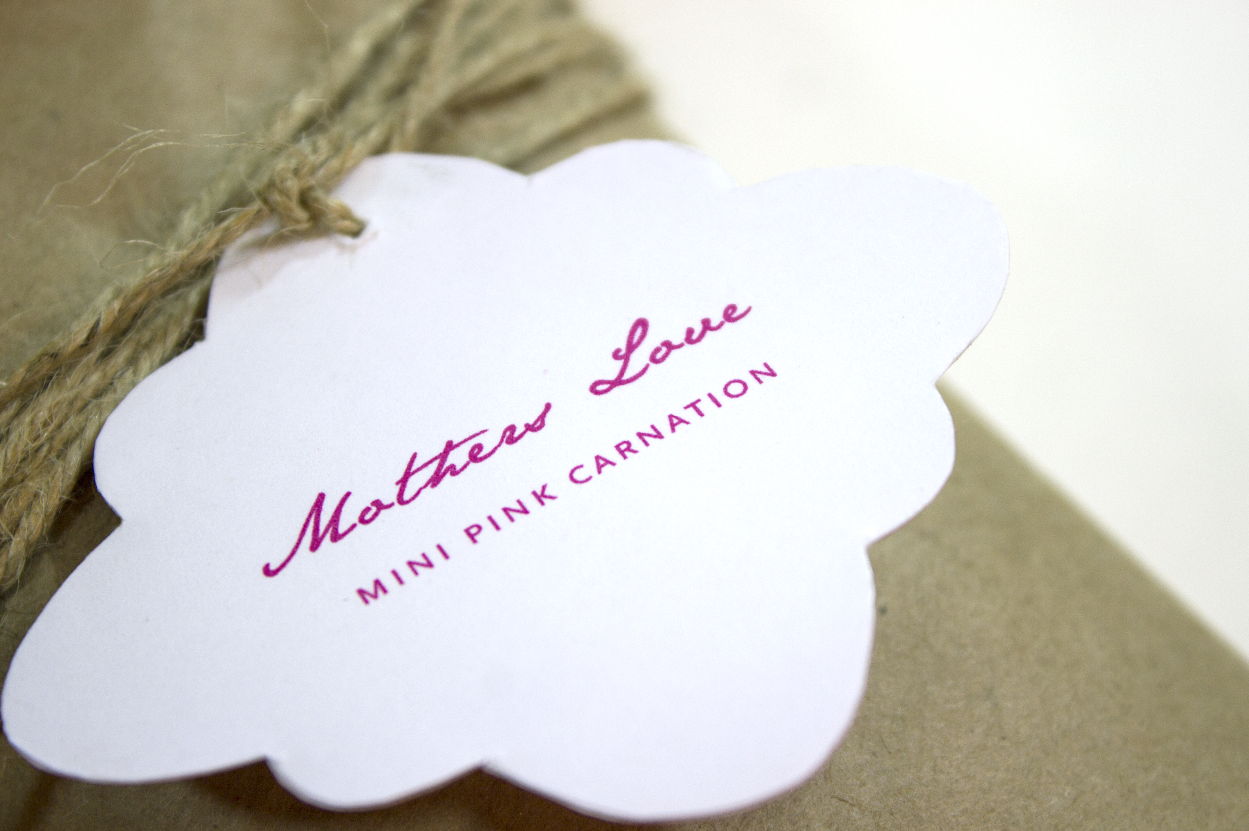
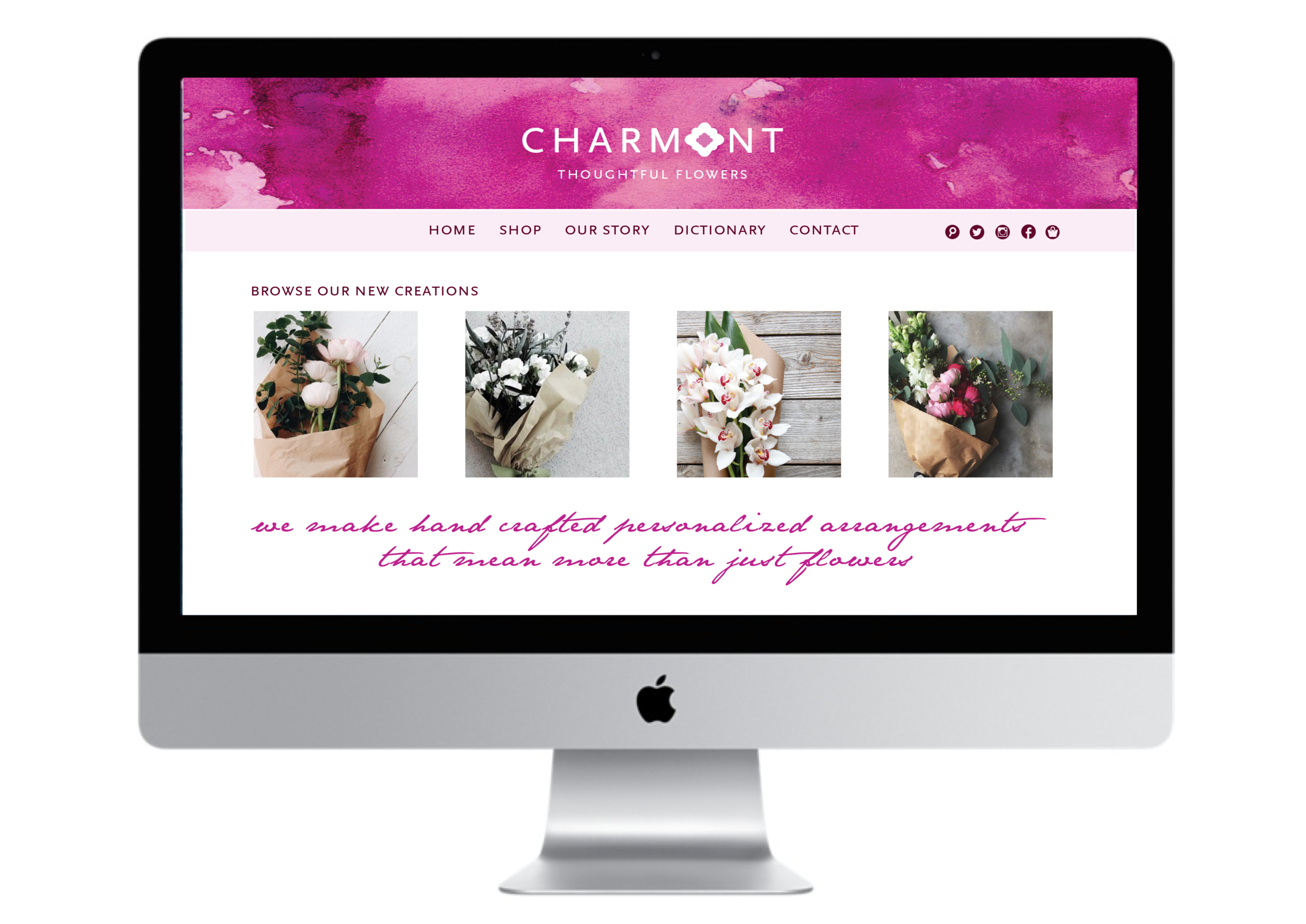
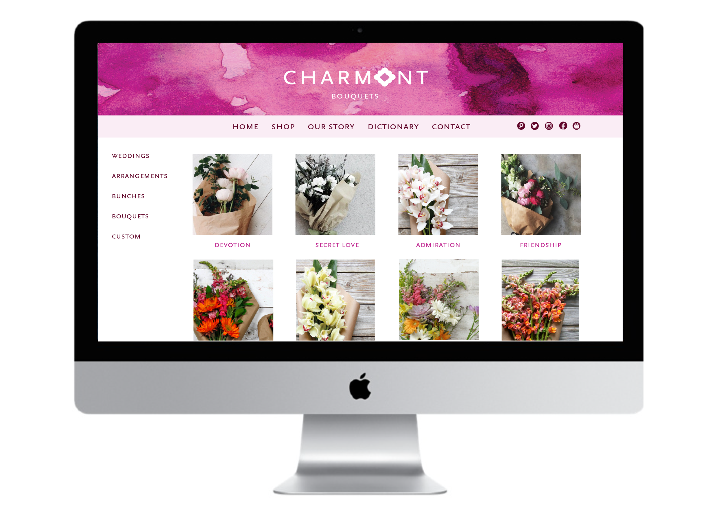
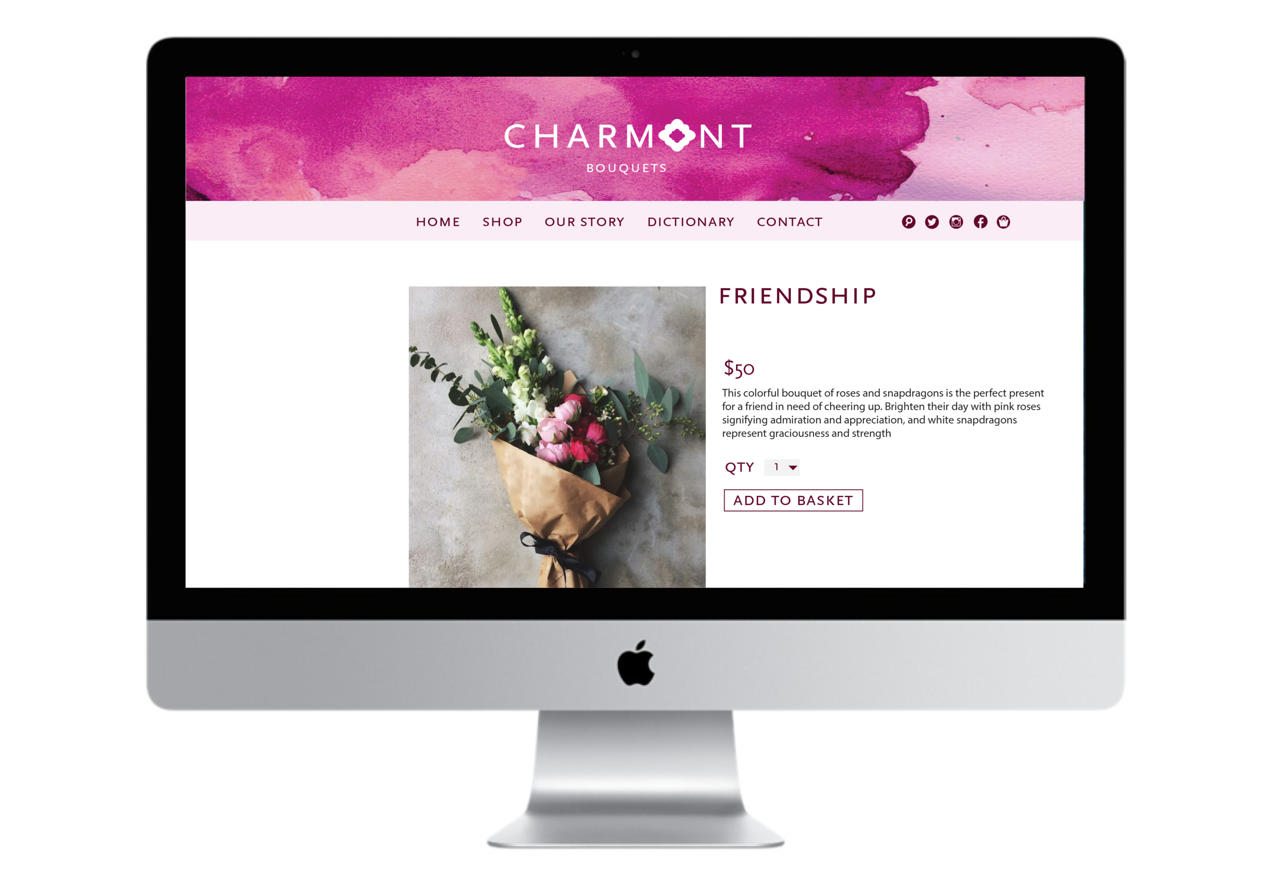
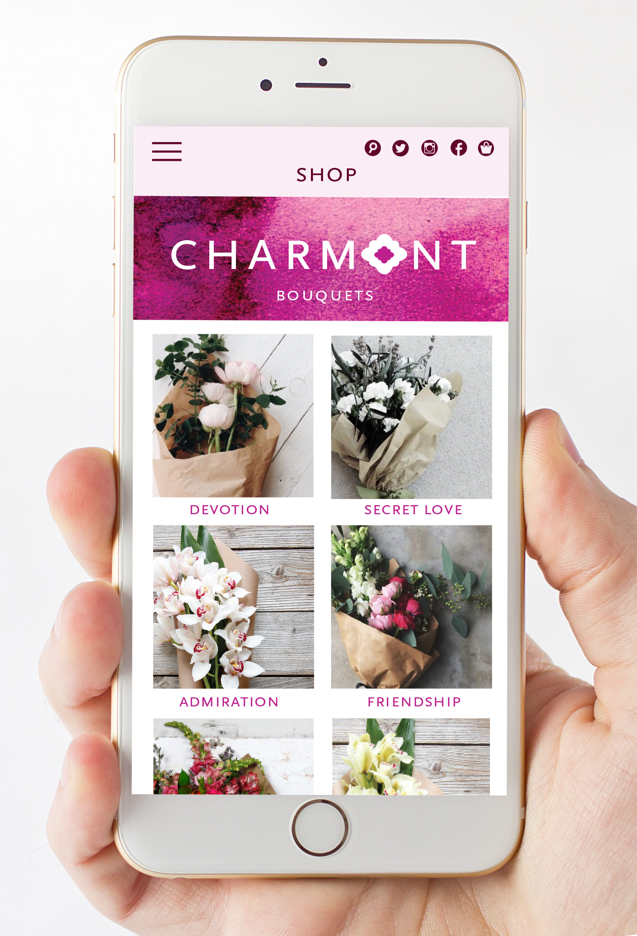
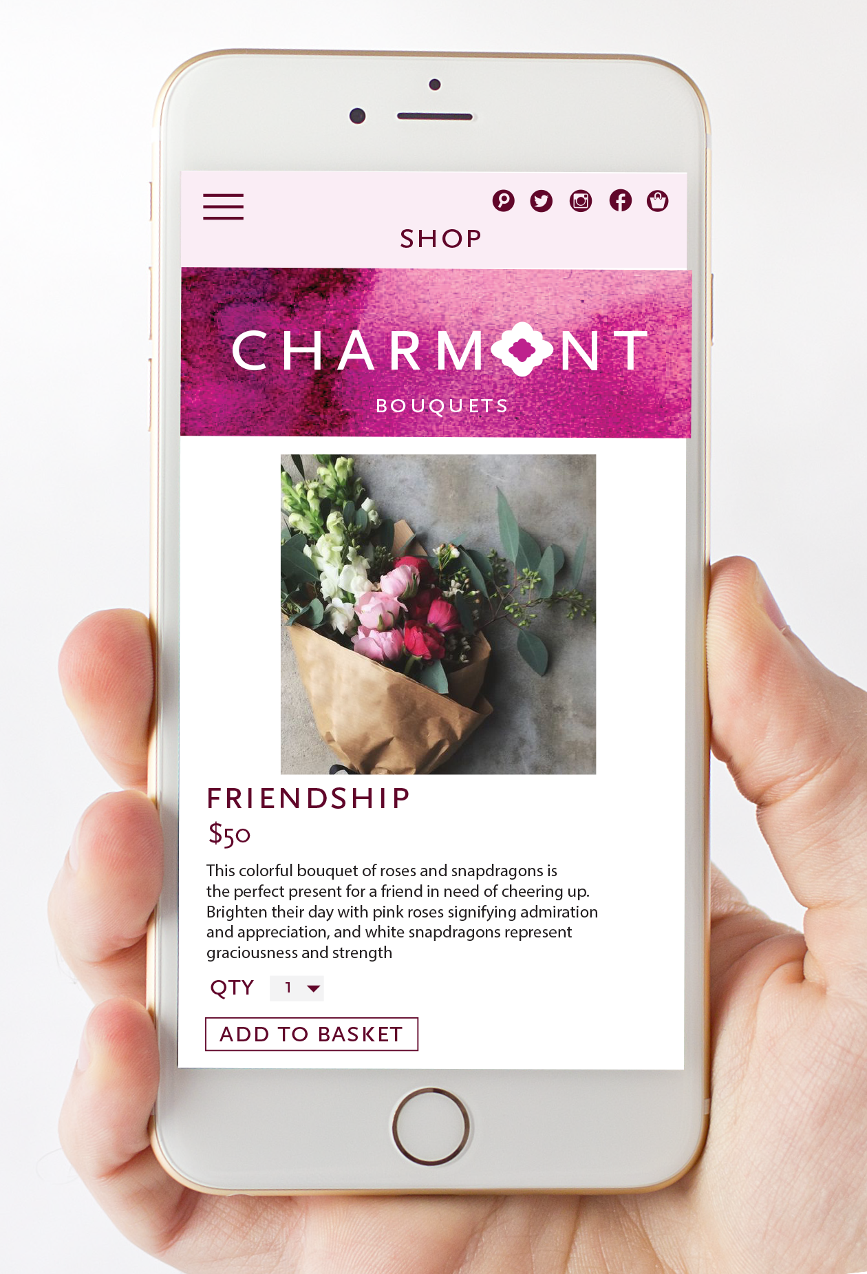
For this project we were challenged to create a fictional company with a cohesive brand identity. I decided to brand a flower shop called Charmont. I came up with the name, the tagline, the logo, designed the business card, website, and flower packaging. What makes this flower shop stand out from its competitors is the fact it’s flower arrangements have specific meanings. Using the Victorian era’s flower dictionary Charmont creates bouquets that mean more than beautiful flowers. Each arrangement has a tag that explains the special meaning behind the flowers used to create it. I decided to make the logo a simplified flower with pink watercolor to add color and texture.